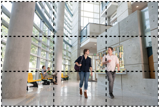
The Rule of Thirds

The rule of thirds is a guideline that applies to the process of composing films and photographs.
The main reason for observing the rule of thirds is to discourage placement of the subject at the center, or to prevent a horizon from appearing to divide the picture in half.
An image should be imagined as divided into nine equal parts by two equally spaced horizontal lines and two equally spaced vertical lines.
Important compositional elements should be placed along these lines or their intersections. Aligning a subject with these points creates more tension, energy, and interest in the composition than simply centering the subject.
The Rule of Thirds is applied by:
- Aligning a subject with the guidelines and their intersection points.
- Placing the horizon on the top or bottom line.
- Allowing linear features in the image to flow from section to section.
Learn more about the Rule of Thirds in this video tutorial.
Cropping

How a photo is cropped can make or break any communications project.
Thoughtful cropping will draw the eye toward the most important aspects of the photo and help tell your story more effectively.
Here are three easy tips to help make an impact:
- Crop out distracting details.
Extraneous details are distracting. Cropping out background and foreground objects redirects focus to what supports your story. This is especially true when there are words or random people in the shot. Anything that breaks the flow of the story or distracts should be cropped out. - Leave in important details.
Without the lab equipment in the frame, this researcher's expression looks odd and the viewer has no idea what she is working on or looking at. Be sure to leave in anything essential to the context of your story. This is called giving your photo a "sense of place." Recent research indicates that prospective undergraduate students strongly prefer photos that provide a sense of place. - Don't crop faces and leave some breathing room.
No one wants their “personal space” invaded when meeting new people or to look like a Picasso painting. Cropping too closely feels claustrophobic and uninviting. Adding some breathing room — known as “look space” — is much more relaxing and pleasing to the eye.
File Size
Crop photos in a photo editing application (such as Photoshop) before inserting them on a webpage or PowerPoint presentation. Doing so significantly reduces the photo's file size.
The type of file that your photo is saved as also makes a difference to the size. Learn more about the different image file types.
